A milestone for the newest Major League Soccer expansion team is here.
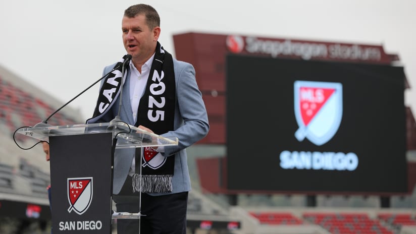
San Diego Football Club unveiled their name, crest and brand identity Friday evening in front of thousands of fans at Snapdragon Stadium, before the 30th MLS club debuts in 2025.
"Our brand identity has been co-created with our fans and supporters over the past six months," said Tom Penn, CEO of San Diego FC. "We believe our crest truly reflects the essence and spirit of San Diego. Our club strives to become the epicenter of football excellence and innovation in North America."
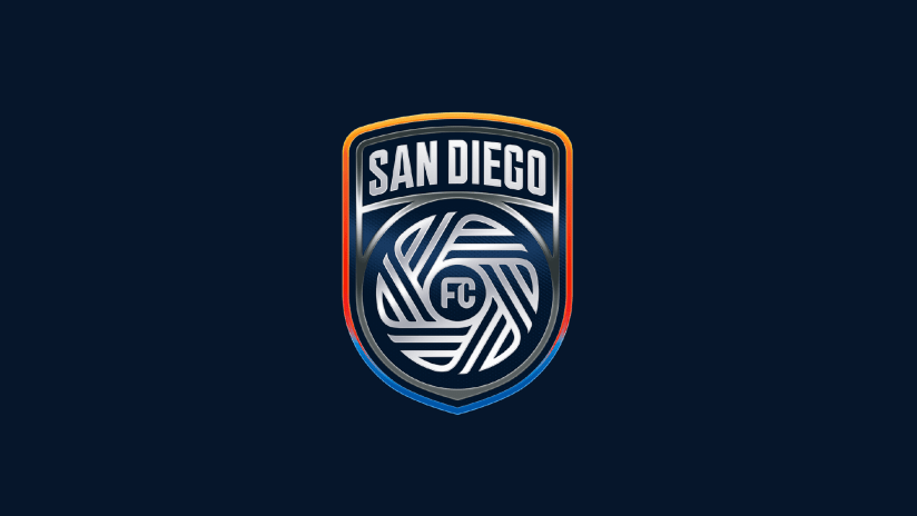
San Diego FC’s crest and visual identity aim to capture the vibrant essence of San Diego, paying homage to the 18 diverse cities that form the Californian community. It was created by world-renowned design agency Pupila, following months of research that focused on four principal virtues:
- Gratitude for the community they call home
- Proud, Not Loud, living with a quiet and understated confidence
- Diversity of communities, neighborhoods, experiences and cultures
- State of Flow, performing at a peak level and embracing a unique rhythm of life
COLORS: Chrome & Azul
Chrome is a symbol of San Diego’s spirit of excellence and cutting-edge innovation. Chrome is reflective and dynamic in nature, an effect as well as a color. Through Chrome, San Diego FC reflects the colors of the community, shades of yellow, orange, red and blue. Azul, a dark navy blue, spotlights San Diego’s deep connection to the Pacific Ocean and the daily enjoyment of the clear blue sky.
CREST
- Central to San Diego FC’s crest is “The Flow,” comprised of 18 lines representing the 18 communities of San Diego County, woven into one.
- “San Diego” is displayed at the top of the crest in the form of an arch, inspired by the iconic neighborhood arches and signs around greater San Diego.
- The shield shape represents the strength and unity of their community. The chrome finish on the shield reflects the colors of the community in the outer layer of the crest.


